Using dithered images on the web
A lot has changed since humanity first dithered an image. Early digital dithering was a way of working around the technical limitations of screens with limited colours. First, they had simple on/off pixels toggling from black to white or green. Later, they could maybe show 16 or even 256 colours! But that was still far too few for most images and dithering helped a lot.
Today, screens can display millions of colours and high-resolution “retina” pixel densities are increasingly common. Ironically, these high quality screens actually require us to work harder to make our anachronistic, pixel-poor, dithery dots look as good as they should.
Here are some tips to help.
Make the most of image-rendering
Section titled “Make the most of image-rendering”Use the CSS image-rendering property to control how browsers scale your dithered images.
Scaling dithered images up
Section titled “Scaling dithered images up”By default, browsers will try to smooth out images when scaling them up. For common image content like photos this is usually desirable, but for dithered images it can ruin the effect.
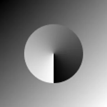
For example, here’s a 100px-wide image being displayed at 300px wide, which makes each individual pixel in the image look a bit smudged or blurred:

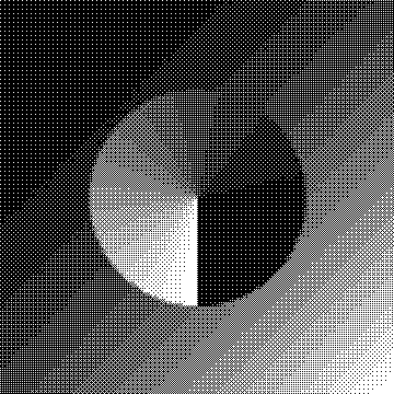
Using the pixelated (or crisp-edges) image rendering algorithm will use nearest-neighbour scaling, preserving the sharp details of your dithered images:
img { image-rendering: pixelated;}Here’s that same image as before.
The only difference is the image-rendering property and now each individual pixel looks crisp and clear:
This is one of the super powers of dithered images! A regular image tends to look bad scaled up, but with the right CSS a small image file can have a big impact.
Scaling dithered images down
Section titled “Scaling dithered images down”While using image-rendering: pixelated is great for scaling dithered images up, it can cause undesirable results when scaling images down.
Let’s flip our example from before.
This time we’ll scale a 300px-wide image down to 85px, 100px, and 110px wide using image-rendering: pixelated.
The middle image is a exactly 3x smaller than the original and looks OK, but because the other two images divide the original size by a fraction, we can see unpredictable moiré patterns interfering with the image:
Three images showing dithered images scaled down using image-rendering: pixelated. The leftmost and rightmost images feature unwanted moiré patterns.
In this case, we can improve the appearance by using the default CSS scaling algorithm instead:
img { image-rendering: auto;}This produces a more predictable (although not always perfect) result across the different sizes:
Three images showing dithered images scaled down using image-rendering: auto. The moiré patterns are reduced.
Small file sizes
Section titled “Small file sizes”Beyond the visual aesthetic, one other advantage of dithered images is their relatively small file size. The actual results will vary by image and dithering algorithm, but here’s one comparison of the same 360px-wide image (scaled down to display side-by-side):
| original | dithered |
|---|---|
 |  |
| 6.58 kB | 1.62 kB |
In this case, even though the original image is an optimized WebP, the dithered image is still more than 4 times smaller than it.
Combine this with the ability to scale dithered images up with image-rendering: pixelated and you can deliver visually interesting images with a very small file size.
Bandwidth-aware and eco-conscious websites have made us of dithered images because of their small size. For example, LOW←TECH MAGAZINE’s solar-powered website notes:
By dithering, we can make images ten times less resource-intensive, even though they are displayed much larger than on the old website.
This is important because, according to the HTTP Archive, the average web page in 2025 downloads around 1 MB of images.